Pivot table filters are your secret weapon for turning a mountain of raw trading data into clear, actionable insights. They let you slice, dice, and isolate specific parts of your performance, helping you instantly answer critical questions like — “Which of my strategies is actually making money?” — or — “What time of day do I trade best?”
Think of them as the tool that transforms a confusing spreadsheet into an interactive analysis dashboard.
Why Pivot Table Filters Are a Trader’s Best Friend
We’ve all been there — staring at a spreadsheet with thousands of logged trades, feeling like we’re trying to find a needle in a haystack. Drowning in data from our trading journals, unsure how to find the patterns that actually matter. The sheer volume of information from wins, losses, commissions, and strategy tags can feel completely overwhelming.
This is exactly where pivot table filters become your most valuable analytical tool. They let you cut through all that noise. Instead of being paralyzed by data, you can ask direct questions and get immediate answers.
From Data Overload to Clarity
Imagine you’re a day trader looking at thousands of trades you’ve logged in a tool like TradeReview. Without the right tools, spotting patterns in your win rates or profit factors is a frustrating, manual exercise. This exact problem is why pivot tables were a game-changer when they first appeared in Excel back in 1993.
Fast forward to today, and their importance has only grown. A 2023 survey by the Corporate Finance Institute found that 85% of financial professionals use pivot tables for data analysis, a testament to their enduring power. You can read more about how professionals use pivot tables to analyze performance data.
Instead of tedious manual calculations, you can apply a few quick filters to instantly see:
- Performance by Symbol: Isolate all your trades on TSLA or AAPL with a single click.
- Strategy Effectiveness: Compare the net profit of your “Breakout” strategy versus your “Mean Reversion” setup.
- Time-Based Patterns: Analyze your performance on Mondays versus Fridays to find out when you’re at your best.
The goal isn’t just to look at data; it’s to have a conversation with it. Pivot table filters are what make that conversation possible, helping you move from guessing to knowing.
Ultimately, mastering pivot table filters builds the discipline required for consistent trading. It helps you stop reacting to random outcomes and start building a systematic approach based on what your own performance data is telling you. That control is the foundation for making smarter, more confident trading decisions.
Building Your Foundation with Basic Filters
Let’s get hands-on with the filters that form the bedrock of any solid analysis. Once you have a clean data export from your trading journal, you’re looking at columns every trader recognizes — ‘Date’, ‘Symbol’, ‘P&L’, and maybe ‘Strategy Tag’. Mastering these fundamental filtering tools is the first real step toward making disciplined, data-informed trading decisions.
The sheer volume of trade data can feel overwhelming, almost like a barrier to entry for analysis. This is where pivot filters come in, helping you cut straight through the noise.
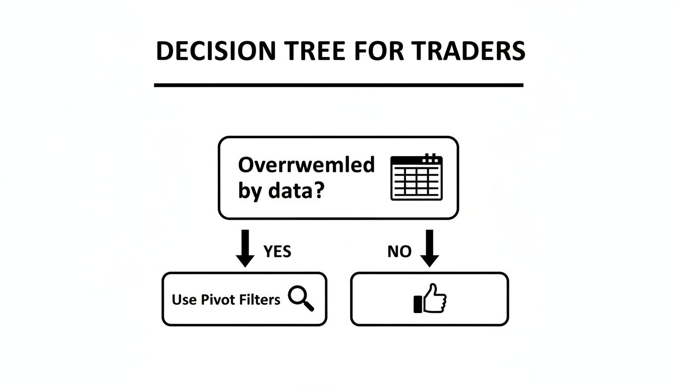
As the decision tree shows, if you feel swamped by your trading data, pivot table filters are your most direct path to regaining control and finding clarity.
Start with Report Filters
Report Filters are your broad-stroke tool, perfect for viewing your entire dataset through a single lens. Think of it as putting a magnifying glass over one specific part of your trading history, like all your trades on a single stock.
To set one up, just drag a field like ‘Symbol’ into the Filters area of your PivotTable Fields list. A new filter dropdown will pop up above your pivot table. From there, you can select ‘TSLA’, and your entire table will instantly refresh to show only data related to your Tesla trades. It’s an incredibly quick way to get a high-level review of your performance on a specific ticker without messing with the structure of your rows and columns.
Quick Analysis with Manual Filtering
While Report Filters look at the whole picture, manual filtering is all about quick, direct comparisons. This method is as simple as checking and unchecking items directly from the dropdown arrows on your Row or Column Labels.
Imagine your ‘Strategy Tag’ is in the Rows area, listing strategies like “Breakout,” “Mean Reversion,” and “Scalping.” Just click the dropdown arrow next to the “Row Labels” header and uncheck everything except “Breakout” and “Mean Reversion.” The pivot table immediately isolates these two, letting you compare their P&L side-by-side in seconds.
This simple check-and-uncheck process is one of the fastest ways to test a hypothesis. Wondering if your breakout strategy outperforms your scalps? A few clicks will give you a data-backed answer, not a gut feeling.
This direct interaction encourages a curious mindset, which is vital for long-term growth as a trader. You start asking better questions because you know how easily you can find the answers. For those new to this, knowing how to structure your data is key; you can learn more about how to build a pivot table to get started on the right foot. It’s all about building confidence one filter at a time.
Deeper Analysis with Label and Value Filters
Once you move past basic manual selections, you unlock a much more powerful, rules-based way to analyze your trades. This is where you stop just looking at your data and start asking it specific, insightful questions — a habit that builds real trading discipline over the long haul.
Label and Value Filters are your tools for this deeper conversation, letting you pinpoint the exact patterns that are hitting your bottom line.
Uncovering Trends with Label Filters
Label Filters work on the text in your row or column labels — think ticker symbols, strategy names, or trade types. Instead of clicking dozens of checkboxes, you create simple rules to find exactly what you need. For anyone trading a wide range of assets, this is a game-changer.
Let’s say you trade a lot of options on SPY. You don’t need to hunt for every single contract. Just set up a Label Filter to show only symbols that “Contain” the letters SPY. Or maybe you’re analyzing a group of tech stocks; a filter for symbols that “Begin With” a specific letter can instantly pull them all together.
It’s all about working smarter. This simple trick saves you from the tedious grind of manual selection, freeing up your mental energy for the actual analysis.
Finding Your Outliers with Value Filters
While Label Filters are about what you’re looking for, Value Filters are about how much. This is where the real magic happens for traders. These filters slice and dice the numerical data inside your pivot table, like P&L, volume, or win rate.
This is how you start spotting the outliers that truly define your performance. We all have those few trades that make or break our equity curve, for better or worse. Value Filters help you find them with surgical precision.
Here are a couple of practical ways you can use this:
-
Isolate Your Big Winners: Set a filter on your
Sum of P&Lcolumn to show only values “Greater Than” $500. This instantly surfaces the trades that are really moving the needle for you. - Identify Your Costliest Mistakes: On the flip side, filter for your “Bottom 10 Items” based on P&L. This forces you to confront the trades that did the most damage — a crucial, if sometimes uncomfortable, step toward getting better.
The shift from staring at averages to hunting for outliers is a critical step in a trader’s development. Your biggest winners and losers almost always hold the most valuable lessons about your strategy and your own psychology.
The power of this type of analysis is well-documented. A case study from Harvard Business Review highlighted how a financial services firm used similar data filtering techniques to identify its top-performing client segments, leading to a significant increase in targeted marketing effectiveness. The same principle applies directly to your trading journal, like one from TradeReview, to find strengths in one strategy or weaknesses in another.
For a deeper dive into these capabilities, check out Microsoft’s official guide on filtering PivotTable data.
By applying these specific pivot table filters, you become an active investigator of your own performance, ready to find — and act on — the insights that truly matter.
Visual Filtering with Slicers and Timelines
Let’s be honest, dropdown menus can feel a bit clunky. For those of us who are more visual, Slicers and Timelines are a total game-changer. They turn your static pivot table into a dynamic, interactive dashboard with simple, clickable buttons.
This approach makes filtering less of a chore and more of a genuine exploration of your trading data. When the tools are this easy to use, you’re far more likely to dig into your performance regularly — a cornerstone of long-term improvement.

Introducing Slicers for Dynamic Control
Think of Slicers as stylish, dedicated filter buttons for your data. Instead of fumbling with dropdowns, you get a clean, separate panel where you can just click to filter. This is incredibly powerful when you want to see how multiple conditions affect your results at the same time.
Let’s apply this to a real trading scenario. From your pivot table, you can insert a Slicer for ‘Strategy Tag’ and another for ‘Trade Type’ (Long/Short). This instantly creates a little control panel right next to your data.
Now, you can ask complex questions with a couple of clicks:
- Click ‘Long’ on the Trade Type Slicer.
- Then click ‘Breakout Strategy’ on the Strategy Tag Slicer.
Instantly, your pivot table updates to show only the performance of your long breakout trades. You get an immediate feedback loop that helps you connect specific actions to concrete results. For a detailed guide on setting up your data for this kind of analysis, check out our article on how to build a spreadsheet to track stocks.
Analyzing Performance Over Time with Timelines
While Slicers are great for categories, Timelines are designed specifically for date-based fields. They give you an intuitive, draggable slider to filter your trade data by day, month, quarter, or year. This is where you can start analyzing your performance against the backdrop of changing market conditions.
Imagine you want to review how you did during last quarter’s volatile market. Instead of manually filtering a massive list of dates, you just insert a Timeline connected to your ‘Date’ field.
A Timeline turns your date filter into a visual tool. You can literally drag the slider to a specific month or week and watch your P&L, win rate, and other metrics update instantly. It’s the most effective way to see how your strategy held up during a specific market event.
This visual approach to pivot table filters is incredibly powerful for spotting patterns you might otherwise miss. Did that shift in market sentiment back in March hammer your mean reversion strategy? A Timeline makes finding the answer as simple as dragging a slider.
Applying Filters in Real-World Trading Scenarios
Knowing the theory is one thing, but the real magic happens when you apply these tools to your own trading data. We’ve all been there — staring at a mountain of trade history, unsure where to even begin. This is where we’ll bridge that gap, walking through practical scenarios that show how pivot table filters lead to smarter, more disciplined trading.
Let’s ditch the abstract concepts and focus on concrete actions you can take to systematically level up your performance. This is about building habits that stick, not just learning a few new clicks.
Scenario 1: Pinpoint Your Best Trades
Every trader has a small set of trades that deliver the lion’s share of their profits. The real challenge is figuring out what makes them tick. By combining Slicers and Value Filters, you can zero in on these outliers with surgical precision.
Start by inserting a Slicer for your ‘Strategy Tag’ and pick the setup you use most often. Then, head over to your P&L column and apply a Value Filter to show only the “Top 10%” of trades. Just like that, your pivot table isolates the absolute best performers for that specific strategy. Now you can dig in — what did they have in common? Was it the time of day, a specific market condition, or a particular entry signal?
Scenario 2: Conduct a Month-End Review
A consistent month-end review is one of those non-negotiable habits that separates serious traders from the rest. Timelines make this process incredibly simple and effective. Instead of wrestling with manual date filters, just insert a Timeline linked to your trade entry date.
With a Timeline in place, you can click any month for an instant performance snapshot. Take it a step further by adding a Slicer for ‘Asset Class’ (like Stocks, Options, or Futures). This lets you quickly compare your win rate for each asset during that period. You might discover your edge in one market faded while another picked up — crucial feedback for planning the month ahead.
It’s so easy to get lost in the day-to-day noise. Using a Timeline for a monthly review forces you to pull back and assess your performance objectively. That discipline is absolutely vital for long-term success.
This kind of focused review is the only way to make sense of complex data. Imagine a trader syncs their brokers to a journal like TradeReview and sees a solid win rate but struggles with profitability. Applying pivot table filters is how you untangle that. A “Top 10” filter on their P&L might reveal that a few large losses are wiping out dozens of small wins — a massive insight that points directly to what needs fixing. You can discover more about using pivot tables to analyze financial data on kotakneo.com.
Scenario 3: Identify Costly Habits
Perhaps the most powerful use for filters is finding — and fixing — your most expensive mistakes. We all have risk limits, but in the heat of the moment, emotions can take over and we break our own rules. You can use filters to hold yourself accountable.
Go to your P&L column and apply a Value Filter to show all trades where the loss is “Less Than” your max acceptable loss (for example, -$250). This instantly brings every single trade where you let a loser run too far to the surface. This isn’t about beating yourself up; it’s about identifying a pattern. Seeing all those rule-breaking trades listed together is a powerful wake-up call to stick to your plan.
For more ideas on how to structure your data for this kind of deep-dive analysis, check out our guide on creating an Excel trading journal.
Common Questions About Pivot Table Filters
As you start weaving pivot table filters into your daily analysis, you’re bound to hit a few common snags. We’ve all been there — staring at the screen, wondering why the data isn’t behaving as expected. Getting these fundamentals down is what builds the discipline for sharp, consistent analysis.
Here are some of the most frequent questions that pop up for traders and how to solve them.
How Do I Get My New Trades to Show Up?
This is probably the most critical habit to form. Your analysis is only as strong as the data behind it, so keeping it fresh is non-negotiable. After you add a new batch of trades to your source data, your pivot table won’t update on its own.
You have to trigger a manual refresh. The quickest way is to right-click anywhere inside your pivot table and hit “Refresh.”
To make this foolproof, set up your source data as an official Excel Table (the shortcut is Ctrl+T) before you even create the pivot table. This simple step tells Excel to automatically expand the data range as you add new rows. That way, a refresh will always grab every single new trade without any extra work.
Can I Stack Multiple Filters on Top of Each Other?
Absolutely. In fact, this is where the real magic happens. Layering filters is how you drill down into hyper-specific segments of your trading performance. Think of it as asking a series of increasingly detailed questions to find exactly what you’re looking for.
For instance, you can combine several pivot table filters to answer a really specific question:
- First, use a Slicer to isolate all trades for the symbol ‘TSLA’.
- Then, add a Label Filter to only show trades where your ‘Strategy Tag’ contains the word “Breakout.”
- Finally, layer on a Value Filter to see only the trades from that group where the ‘P&L’ was greater than $200.
Each filter narrows the field, building on the last one. You can instantly turn a sea of a thousand trades into the handful that meet your precise criteria, helping you uncover patterns you’d otherwise miss.
Combining filters is how you move from basic reporting to deep investigation. It’s the difference between knowing your overall win rate and knowing your win rate on Tuesday afternoon breakout trades in tech stocks.
Why Are Some of My Trades Missing from the Filter List?
This one is incredibly frustrating. You know a trade exists in your data, but it’s nowhere to be found in the filter dropdown. Nine times out of ten, the culprit is a subtle inconsistency in your source data. A pivot table demands clean, uniform data to work its magic.
The usual suspects are:
- Sneaky Spaces: A symbol typed as “TSLA ” (with a trailing space) is treated as a completely different item from “TSLA”.
- Mixed Data Types: A column that contains both numbers and text can throw off your filters.
- Blank Cells: Gaps in your data, especially in key columns like ‘Symbol’ or ‘Date,’ can cause entire items to be ignored.
Do yourself a favor and spend a few minutes cleaning your source data before you get started. Excel’s “TRIM” function is great for zapping extra spaces, and you should always make sure your columns have a consistent data type. A little data hygiene up front will save you hours of headaches later.
Ready to turn these insights into action? TradeReview offers a powerful, free trading journal with performance analytics, a visual trade calendar, and automatic broker sync. Stop guessing and start analyzing with a tool built to help you grow.