Ever felt like the market moved against you the second you placed a trade? It’s a common, gut-wrenching feeling, but it’s rarely random. What you’re often experiencing is the market’s natural rhythm — a three-part cycle driven by large institutions, or what traders often call “smart money.”
This cycle of accumulation, manipulation, and distribution is the hidden engine behind the major price moves we see on our charts every day.
Why Understanding The Market Cycle Is Crucial
If you’ve ever been stopped out right before the price rockets off in the direction you originally predicted, you’ve already had a front-row seat to this cycle in action. It’s an incredibly frustrating part of trading, and it’s a struggle many traders face. But it’s not a sign that the market is “out to get you.”
Instead, it’s just a byproduct of how big financial institutions have to operate.
Unlike retail traders, who can jump in and out of positions with a click, institutions managing billions can’t just slam the “buy” button. Doing that would create a massive price spike and completely ruin their own entry. They have to be much more subtle, methodically building and then later exiting their positions over time. This patient, long-term approach is key to their success.
This quiet maneuvering creates a predictable, three-phase pattern:
- Accumulation: This is the stealth phase. Institutions are quietly buying up an asset without tipping off the rest of the market, often causing prices to churn sideways in a range.
- Manipulation: An engineered price move designed to hunt for liquidity (a large number of available buy or sell orders). This is where they trigger stop-loss orders and trick emotional traders into taking the wrong side of the market.
- Distribution: The final act. Institutions begin to sell their large positions for a profit, offloading them to the wave of enthusiastic buyers who are just now jumping on the trend.
This concept map helps visualize how these phases flow into one another, creating a repeatable loop.
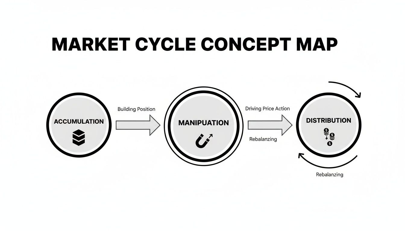
As you can see, one phase logically sets up the next, forming a pattern that plays out across all markets and timeframes.
The Three Market Phases at a Glance
To make this even clearer, let’s break down the goals and psychology behind each phase. This table gives a quick summary of what the “smart money” is trying to accomplish and how the average retail trader typically feels during each stage.
| Phase | Smart Money’s Goal | Typical Price Action | Common Retail Trader Emotion |
|---|---|---|---|
| Accumulation | Buy discreetly at low prices | Sideways, range-bound, boring | Impatience, boredom, uncertainty |
| Manipulation | Induce panic to create liquidity | Sharp, fast moves against the trend | Fear, confusion, “FOMO” (Fear Of Missing Out) |
| Distribution | Sell discreetly at high prices | Choppy, failing to make new highs | Greed, euphoria, overconfidence |
Recognizing these dynamics in real-time is what separates reactive traders from strategic ones.
Shifting Your Trading Perspective
Learning to spot this accumulation, manipulation, and distribution cycle isn’t about finding a magic, can’t-lose strategy. Let’s be real — nothing like that exists in trading. It’s about shifting your entire perspective from being a pawn in the game to an observer who understands the rules.
Instead of getting caught in the emotional traps set during the manipulation phase, you can learn to recognize them as clues for what might happen next.
Think of it as learning the market’s body language. By understanding the motivations of the biggest players, you can start to anticipate their moves instead of just reacting to them.
This framework gives you a structured way to make sense of what you’re seeing. It adds a deeper layer to simply looking at bars on a chart. To build on this, you might find our guide on price action trading helpful for connecting these concepts.
Ultimately, the goal is to build discipline and a long-term mindset. It takes patience and a lot of practice, but recognizing these phases can give you a powerful edge, helping you trade with more clarity and confidence.
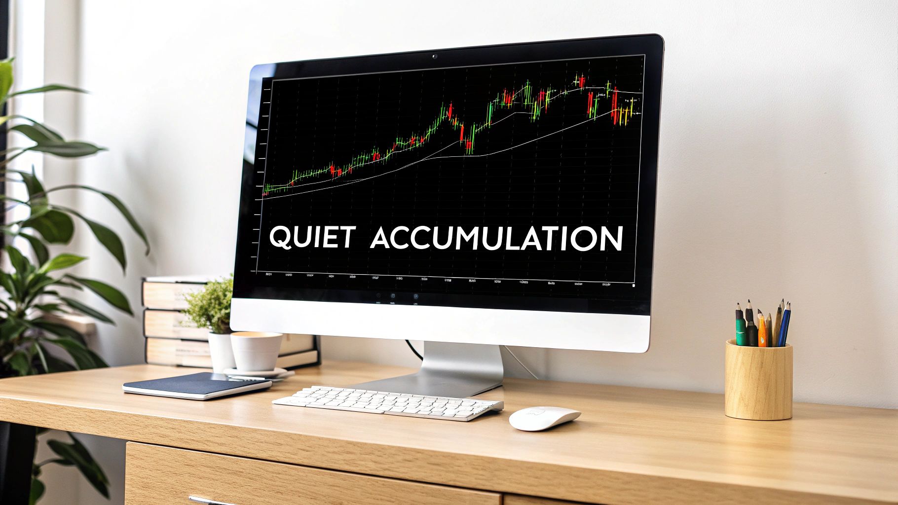
The Accumulation Phase: Spotting Where Big Moves Begin
Picture a massive freighter being loaded up with cargo before a long voyage across the ocean. From a distance, the process looks slow, almost boring. This is the perfect analogy for the accumulation phase in the market — it’s the quiet, methodical groundwork laid by institutional investors, or “smart money,” right before a major uptrend kicks off.
To the average trader, this period often just looks like a dead market. You see prolonged, sideways price action with very little excitement, and it’s easy to dismiss it as an asset that’s going nowhere. But beneath that calm surface, a massive power shift is happening. Big institutions are systematically buying up every share they can get their hands on, absorbing supply from sellers without creating a sudden price jump that would give away their game.
Practical Example: Imagine a stock has fallen from $100 to $50. For several weeks, it trades between $50 and $55. Most people are either scared to buy or bored. But a large fund sees value at this price. They begin buying small amounts every day, careful not to push the price above $55, slowly accumulating a large position.
Their entire goal is to build a huge position at the best possible prices. This patient, disciplined buying is what fuels the next explosive move higher. We’ve all felt that sting of watching an asset trade flat for weeks, only to skyrocket the moment we finally give up and sell. That frustration is often a direct result of missing the subtle clues of accumulation.
Key Characteristics of an Accumulation Phase
Learning to spot accumulation means you have to become a bit of a market detective. You’re looking for clues that reveal what the big players are secretly doing. While no single signal is a silver bullet, combining a few observations can paint a very clear picture.
Here are the tell-tale signs to watch for:
- Prolonged Ranging: The price gets stuck in a well-defined horizontal channel. It feels like it’s going nowhere, making lower highs and higher lows that just churn sideways.
- Decreasing Volatility: As the phase drags on, the trading range often gets tighter. This is a sign that sellers are getting exhausted and the available supply is drying up.
- Volume Clues: This is the most important piece of the puzzle. You’ll start to notice that trading volume picks up on the small up-moves inside the range but dries up completely on the dips. This tells you buyers are stepping in with force, while selling pressure is incredibly weak.
The big idea here is that demand is quietly and persistently overpowering supply. Every time the price tries to dip, strong hands are waiting to scoop it up, preventing it from falling any further. This slow absorption is the true hallmark of accumulation.
Using Volume Profile to See the Unseen
This is where tools like the Volume Profile can give you a serious edge. Unlike traditional volume bars at the bottom of your chart, this indicator shows you exactly how much volume was traded at specific price levels.
During an accumulation phase, you’ll often see a big bulge in the Volume Profile — a “high-volume node” — form right in the middle of the trading range. This is the price level where the institutions are doing the bulk of their buying. For anyone looking to get better at spotting these patterns, our guide on how to read stock charts is a great place to start.
By combining these observations, you can start to tell the difference between a real accumulation manipulation distribution setup and a consolidation phase that’s going nowhere. It takes patience, but the reward is learning how to spot massive opportunities before the rest of the market has any idea what’s happening.
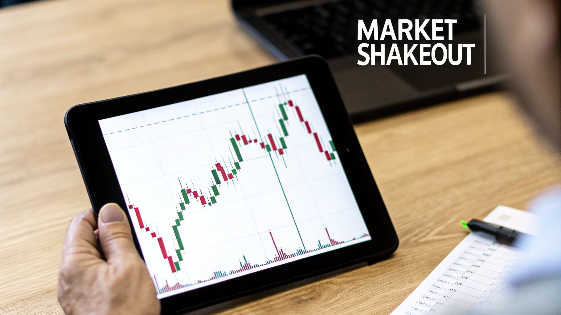
Unmasking Market Manipulation: The Classic Shakeout
After the quiet accumulation phase wraps up, the market often enters its most treacherous stage — manipulation. This is where the big players — the institutions — start engineering sharp, sudden price moves designed to trip up retail traders. It’s a painful but absolutely critical part of the cycle to understand, because this is precisely where most emotional trading mistakes are made.
The textbook example of this is the “shakeout,” also known as a “stop hunt.” If you’ve ever been stopped out of a great trade only to watch the price violently reverse and rocket in your original direction, you’ve been a victim of a shakeout. It feels personal, but it’s not. It’s just a calculated move by large players to build liquidity.
Anatomy of a Stop Hunt
Picture this: a clear support level has formed at $50, and countless traders have placed their buy orders right there, with their stop-losses tucked just below it at, say, $49.50. Smart money knows these orders are clustered together like a beacon. To grab them, they can ram the price down to $49, pushing it just past that obvious support level.
This single, aggressive move is highly effective, accomplishing two things at once:
- It triggers the stop-loss orders from all the early buyers, forcing them to sell.
- It baits breakout sellers into jumping on new short positions, tricking them into thinking support has finally cracked.
Now, with this giant pool of sell orders — liquidity — suddenly available, the institutions can step in and scoop it all up at a bargain. They absorb all the selling pressure, and with no sellers left, the price has nowhere to go but up. And it usually moves fast.
It’s a frustrating reality of trading. The very tools designed to protect you, like stop-losses, can be weaponized by bigger players. The answer isn’t to ditch risk management, but to get better at spotting when these manufactured events are about to unfold.
Turning the Tables on Manipulation
Instead of getting burned, you can learn to see these shakeouts as high-probability entry signals. The tell-tale sign is a rapid price dive on a huge spike in volume, followed by an even faster rejection and recovery back above the key level. That sharp “V-shaped” recovery is your clue that the move wasn’t a genuine breakdown — it was a manufactured hunt for liquidity.
This tactic isn’t just for small-scale chart patterns, either. The same principles of wealth concentration and manipulation play out on a global scale. Research shows that North America controls a significant portion of all private financial assets. According to this detailed report from Allianz, while the United States’ share of global wealth has held steady over the last two decades, China’s has grown substantially. This hints at powerful forces at play to preserve and grow concentrated capital.
Learning to recognize these patterns takes practice and a whole lot of discipline. It means you have to fight the fear and panic these moves are specifically designed to create. If you can stay patient and wait for confirmation that the breakdown has failed, you can position yourself to trade with the smart money, right as the real move is about to kick off.
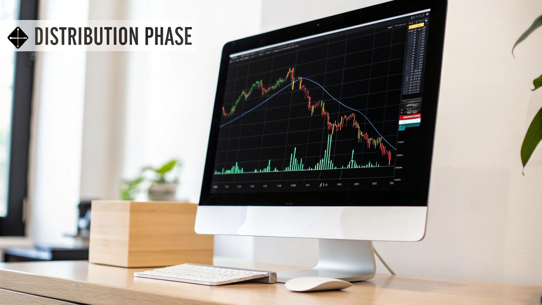
The Distribution Phase: Recognizing a Market Top
After a thrilling run-up, just when euphoria is peaking, the market quietly enters its final act: the distribution phase. This is the mirror image of accumulation. Where institutions once bought in silence, they now begin to methodically sell — or distribute — their massive positions to the wave of enthusiastic retail traders chasing the trend, terrified of missing out.
To the untrained eye, this phase often just looks like a sideways consolidation at a market top. The price action gets choppy and indecisive, lulling buyers into a false sense of security. But under the hood, the mechanics have completely flipped. Sellers are now in control, carefully offloading their inventory without causing an outright panic.
Spotting the Signs of a Market Top
Recognizing distribution means you have to shift your focus from looking for buying pressure to spotting selling pressure. You’re no longer searching for signs of strength. Instead, you’re hunting for clues of underlying weakness that warn of an impending downtrend. It’s a tough psychological shift because it means questioning a trend that still looks powerful on the surface.
Here’s what to look for:
- Heavy Volume on Down-Moves: Unlike accumulation, you’ll see big volume spikes when the price falls within the range. This is a huge tell that large players are using any dip to sell aggressively.
- Weak Volume on Rallies: Any attempts to push the price to new highs are often met with weak, unconvincing volume. This shows a lack of genuine buying interest needed to keep the uptrend alive.
- Failure to Make Higher Highs: The price repeatedly tries to break out to the upside but fails, creating a clear resistance ceiling. Each failure just solidifies the sellers’ control.
This phase preys on the greed and overconfidence of traders who have enjoyed a long uptrend. Protecting your profits requires the discipline to see that the party is likely ending.
The Upthrust After Distribution (UTAD)
One of the most classic distribution patterns is the Upthrust After Distribution (UTAD). Think of it as a final, deceptive trap designed to catch the very last of the hopeful buyers. It’s the distribution equivalent of the shakeout we see after accumulation.
A UTAD happens when the price briefly breaks above the established resistance of the trading range, creating the illusion of a powerful breakout. Eager buyers pile in, only for the price to fail spectacularly and reverse right back down into the range.
This move serves one primary purpose: to trap the last of the “dumb money” at the absolute peak. This dynamic of capital moving from institutional hands to the public is a recurring theme. The ratio of global wealth to income has surged in recent decades, driven by capital gains in financial markets. You can discover more insights on these vast global capital accumulation cycles.
Learning to identify the signs of distribution isn’t about perfectly timing the top — that’s nearly impossible. It’s about recognizing the mounting evidence that the risk-to-reward has shifted, giving you the signal to protect your capital before the inevitable decline begins. The complete accumulation manipulation distribution cycle offers a roadmap, and this final phase is your exit sign.
How to Journal and Review Your Trades Effectively
Spotting accumulation, manipulation, and distribution on a clean chart after the fact is one thing. But actually using that knowledge in the heat of a live market? That’s a whole different ball game. This is precisely where a disciplined trading journal becomes your secret weapon for real, lasting improvement.
It’s way too easy to get swept up in the fear and greed of the moment. A journal, however, doesn’t have emotions. It’s the objective record of what you did and why you did it, turning your trading from a string of random bets into a data-driven process you can actually refine.
Building a Phase-Specific Journaling Workflow
A truly useful journal captures more than just your entry, exit, and P&L. To really get a handle on the AMD cycle, you need to log your market thesis — your story about what you thought was happening when you placed the trade. This context is what makes your review sessions so incredibly valuable.
Start by building a simple, structured workflow for every single trade. Instead of just dumping in the numbers, focus on documenting your reasoning through the lens of the market cycle.
Before you ever hit “buy” or “sell,” force yourself to answer a few critical questions:
- What phase do I believe the market is in right now? (e.g., Accumulation, Post-Shakeout, Distribution)
- What specific price and volume signals back up my theory? (e.g., High volume on up-moves, a failed breakout attempt)
- What would have to happen for me to know I’m wrong? (e.g., Price breaking back below the manipulation low)
Getting this thought process down on paper is how you create the feedback loop you need to get better.
Using Tags to Uncover Your Patterns
The real magic happens when you start tagging and categorizing your trades. A digital journal like TradeReview makes this a breeze. Ditch generic labels and create tags that are hyper-specific to the accumulation, manipulation, and distribution model.
Think of your journal as your personal trading laboratory. Tagging your trades with specific setups and outcomes lets you run experiments on your own performance to discover what actually works for your style.
Over time, you can filter your trade history to answer questions that would otherwise be impossible to tackle. For example, you could instantly pull up every trade you’ve ever tagged with “Caught in Shakeout” to see what you keep missing.
Here are a few tag ideas to get you started:
Accumulation EntryDistribution ExitCaught in ShakeoutBotched UTAD ShortTraded Breakout (Failed)Waited for Confirmation
After logging just 20-30 trades with these kinds of tags, you’ll start to see your personal habits — both good and bad — emerge with stunning clarity. Are you constantly trying to front-run the shakeout? Do you have a hard time holding shorts through the entire distribution phase? The data in your journal will give you the cold, hard facts.
This structured approach is what separates amateurs from pros. As any consistently profitable trader will tell you, the foundation of their success is built on rigorous self-analysis. To dig deeper into this, check out our guide on why every trader needs a trading journal. This is how painful lessons slowly but surely turn into profitable habits.
Frequently Asked Questions
Trying to wrap your head around accumulation, manipulation, and distribution can feel like a lot at first. It’s totally normal to have questions pop up as you start applying this framework to a live chart. Let’s tackle some of the most common hurdles traders run into.
How Can I Tell Accumulation Apart From a Bearish Consolidation?
This is a fantastic question and a distinction that trips up a lot of traders. The secret lies in watching how volume behaves at the edges of the trading range.
In a true accumulation phase, you’ll usually see bigger volume spikes on the rallies and noticeably weaker volume on the dips. It’s a clue that big players are actively soaking up shares and there just isn’t much appetite for selling.
On the other hand, a bearish consolidation (or re-distribution) often shows the opposite pattern. You’ll see heavier volume on the declines and anemic, low-volume bounces. This tells you that sellers are still in charge, just taking a breather before the next push down.
The real giveaway? That classic “spring” or shakeout below a key support level that gets bought back up almost immediately. That’s a powerful signal you’re watching accumulation in action, not a continuation of the downtrend.
Does This Trading Model Work on All Timeframes and Markets?
Absolutely. The beauty of accumulation, manipulation, and distribution is that these principles are fractal. What that means is the underlying pattern shows up on all timeframes, from a 5-minute chart all the way up to a weekly one.
The core logic — that large institutions have to strategically build and offload their huge positions — is universal.
The only real difference is how long each phase takes. An accumulation range might develop over weeks on a daily chart, but it could all play out in just an hour on an intraday chart. This model is just as effective in stocks, forex, crypto, and commodities — basically, any market with enough big-money participation.
What Is the Most Important Tool for Identifying These Phases?
If you had to pick just one tool, volume is without a doubt the most critical piece of the puzzle. Price action by itself can be incredibly misleading, especially when manipulation is in play. But volume often gives the game away, revealing the real intent behind the price moves.
Your standard volume bars are a must-have, but digging deeper with tools like the Volume Profile can give you an even bigger edge. It shows you exactly where the most trading activity has happened, often pinpointing the heart of an accumulation or distribution range.
When you combine a deep analysis of volume with the story price is telling, you get the most reliable framework for making sense of the accumulation manipulation distribution cycle.
Ultimately, these market dynamics are a reflection of a much larger, global pattern of wealth concentration. For example, according to data available on global inequality trends on inequality.org, the richest 1% of the world’s population hold a vastly disproportionate share of global wealth compared to the bottom 50%. These figures show that capital is becoming more and more concentrated, which fundamentally shapes how wealth moves through the markets.
Mastering these phases isn’t something that happens overnight. It takes patience, discipline, and a willingness to learn from your mistakes. Forget about instant success; focus on getting a little bit better, every single day.
Ready to turn these insights into your own actionable data? Start journaling your trades with TradeReview today. Our platform helps you tag, analyze, and review your performance through the lens of market cycles, transforming painful lessons into a clear path for improvement. Sign up for free and take control of your trading.