Diving into the market without testing your strategy is like sailing without a map — you’re just hoping for the best. A solid Portfolio Visualizer backtest cuts through the noise and gives you the data you need to build real confidence, stress-testing your ideas against decades of market history. It’s the essential step that turns a good idea into a strategy you can actually rely on.
Why Backtesting Is a Trader’s Most Essential Tool
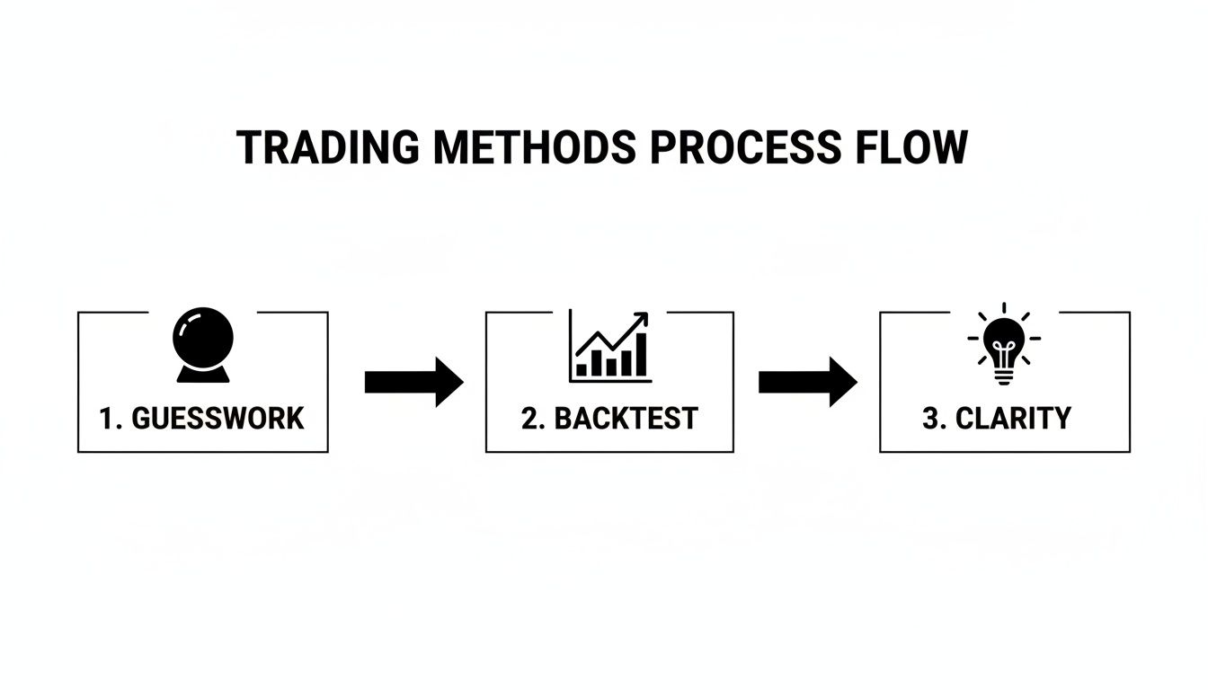
Every trader gets that gut feeling — the hunch that a stock is about to pop or the fear of missing out on a massive trend. We’ve all been there. Those impulses are powerful, but they’re also why so many traders struggle. Trading on emotion instead of evidence is a recipe for painful losses.
This is exactly where backtesting comes in. It’s not about finding some mythical, “guaranteed profit” formula. It’s about replacing guesswork with a data-driven approach. By running your strategy against historical data, you get to see how it actually would have performed through bull markets, bear markets, and everything in between.
Moving Beyond Hope and Hype
Without data, it’s dangerously easy to fall in love with a strategy that feels right, even if it’s fundamentally flawed. You might see a new investment idea blow up on social media or hear a convincing pitch from a so-called guru. The temptation to jump in right away is huge, but it’s a path that often leads to impulsive, costly mistakes.
A proper Portfolio Visualizer backtest is your reality check. It forces you to look at the cold, hard numbers and see the unvarnished truth about your strategy’s potential. This process helps you:
- Set Realistic Expectations: You’ll see what kind of returns, volatility, and drawdowns your strategy might have realistically produced in the past.
- Build Real Discipline: When you have data showing your strategy can weather storms, it’s much easier to stick with it when things inevitably get choppy.
- Uncover Hidden Flaws: You might discover weaknesses you never thought of, like how your strategy falls apart in high-interest-rate environments or how two “uncorrelated” assets actually move together during a crisis.
Think of backtesting as a flight simulator for your portfolio. It lets you experience decades of market chaos in just a few minutes, teaching you critical lessons without risking a single dollar of your capital.
Cultivating Long-Term Thinking
The market is a constant firehose of short-term noise. It’s easy to get sidetracked by daily price swings and lose sight of the bigger picture. Backtesting forces you to adopt a long-term perspective by demonstrating that even the best strategies go through rough patches.
For instance, a backtest might show that while your portfolio delivered a strong 10% average annual return over 20 years, it also suffered a gut-wrenching -25% maximum drawdown along the way. Knowing this beforehand prepares you mentally for that kind of volatility. It turns what could be a panic-selling moment into just another expected part of the journey. This isn’t just an academic exercise; it’s how you build the mental toughness required for lasting success in the markets.
Running Your First Portfolio Visualizer Backtest
Alright, enough theory. It’s time to jump in and get our hands dirty. Running your first backtest in Portfolio Visualizer can look a little daunting with all the different knobs and dials, but it’s actually pretty simple once you see it in action. We’ll walk through it together using a classic 60/40 portfolio as our practical example.
The goal here isn’t to create a revolutionary, market-crushing strategy right out of the gate. It’s about building a core skill: turning a simple investment idea into a tangible, data-backed analysis.
Defining Your Test Parameters
Before you even think about plugging in tickers, you have to set the stage. The initial parameters you choose are crucial because they create the entire context for your backtest. Get these wrong, and your results could be misleading.
Here are the most important settings to get right from the start:
- Time Period: We suggest selecting “Month-to-Month” for more granular data. This lets you see how a portfolio behaves during specific market meltdowns or rallies, not just a smoothed-out yearly average.
- Start Year and End Year: Go for the longest timeframe possible. A strategy that looks amazing from 2010 to 2020 might look terrifying if you include the dot-com bust or 2008. You need to see how it holds up through multiple market cycles.
- Initial Amount: Let’s start with a hypothetical $10,000. It’s a relatable number and makes the final performance figures easy to grasp.
- Rebalancing: This is a big one. Rebalancing is just the act of selling what’s done well and buying what’s lagged to get back to your original target percentages. It enforces a “buy low, sell high” discipline automatically.
For our 60/40 example, we’ll choose Annually. This is a common, set-it-and-forget-it approach that keeps the portfolio in check without racking up a ton of trades.
Building a Simple 60/40 Portfolio
Now for the fun part — adding the assets. We’ll keep it simple and use two well-known, low-cost ETFs to represent the entire stock and bond markets.
We’re going to allocate 60% to the Vanguard Total Stock Market ETF (VTI) and the other 40% to the Vanguard Total Bond Market ETF (BND).
In Portfolio Visualizer, you’ll just punch in the tickers and their target weights:
- Portfolio 1, Asset 1: VTI, 60%
- Portfolio 1, Asset 2: BND, 40%
Start with a simple two or three-asset portfolio. When you’re just learning the ropes, complexity is your enemy. Nail the basics here before you move on to testing more intricate strategies with ten different assets.
This process is what takes you from guessing to knowing. It’s a shift from random decisions to an evidence-based approach.
Finalizing Settings and Running the Analysis
With our timeframe, starting capital, rebalancing rules, and assets locked in, we’re ready to go. For a first run, you can just leave the other settings like “Cashflows” and “Leverage Type” on their default values.
Now, just hit that big blue “Analyze Portfolios” button.
In that single click, you’ve taken a simple idea and stress-tested it against decades of real-world market data. It’s no longer just a theory; it’s a strategy with a documented track record. Portfolio Visualizer is an incredible (and free) place to start building these skills.
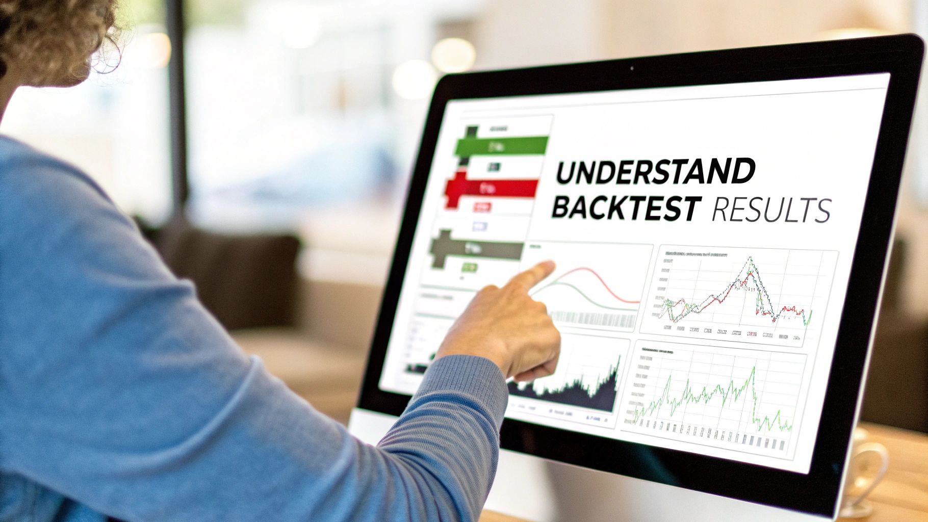
The results will spit out a ton of information, from the final balance and annual returns to the gut-wrenching drawdowns. This is the raw data you need to start making more disciplined, confident trading decisions. In the next section, we’ll dive into what all these numbers actually mean.
How to Interpret Your Backtest Results
You’ve hit the “Analyze Portfolios” button, and now you’re looking at a screen packed with numbers, charts, and financial jargon. It can feel a bit like trying to read a foreign language at first, but don’t worry. This data tells the story of your strategy’s past — its wins, its losses, and its overall personality.
Let’s break down the most important numbers so you can turn them into actionable intelligence.
This screen is where the real work of a portfolio visualizer backtest begins. It’s not just about chasing the highest final balance; it’s about understanding the journey your portfolio took to get there. After all, a strategy that looks amazing on paper might have been an emotional rollercoaster to actually live through.
Unpacking the Core Performance Metrics
Your eyes probably jump straight to the Final Balance and the CAGR (Compound Annual Growth Rate). And that’s natural. But these metrics only show the reward. To get the full picture, you have to look at the risk you took to get that reward.
Here are the key metrics to focus on first:
- CAGR (Compound Annual Growth Rate): This is the smoothed-out, year-over-year growth rate. Think of it as the average return you would have needed each year to get from your starting balance to your ending balance. A higher CAGR is generally better, but it never tells the whole story.
- Stdev (Standard Deviation): This is your volatility score. In simple terms, it measures how much your returns bounced around the average. A high number means the value of your portfolio swung wildly up and down, while a low number indicates a much smoother ride. Two portfolios could have the same 10% CAGR, but one might have done it with 8% volatility while the other had a gut-wrenching 20%.
- Best Year / Worst Year: These numbers give you a feel for the extreme outcomes and help prepare you for the emotional highs and lows. Seeing that your strategy had a “worst year” of -20% helps you mentally prepare for that possibility, making you less likely to panic-sell at the worst possible time.
A common mistake is chasing the highest CAGR without looking at the volatility and drawdown. A high-return strategy is useless if its volatility is so extreme that you can’t emotionally stick with it through the tough times. Discipline is built on realistic expectations.
Understanding Your Strategy’s Resilience
Returns are great, but surviving the downturns is what keeps you in the game long enough to actually earn them. This is where drawdown metrics become your best friend. They show you exactly how your strategy held up when the market was in a freefall.
The most critical one to watch is the Maximum Drawdown. This is the biggest peak-to-trough drop your portfolio experienced during the backtest. If your test shows a maximum drawdown of -30%, it means that at some point, your account was down 30% from its previous all-time high.
Understanding this number is vital. You might think you can handle a -40% drop in theory, but seeing it in black and white forces you to be honest with yourself about your real risk tolerance. You can learn more about how to interpret maximum drawdown in our detailed guide.
Putting It All Together with Risk-Adjusted Returns
So, how do you balance risk and reward in a single number? That’s where ratios like Sharpe and Sortino come in. They combine performance and volatility into a simple, comparable score.
To make these easy to understand, here’s a quick reference table.
Key Backtesting Metrics Explained
| Metric | What It Measures | Why It Matters for Traders |
|---|---|---|
| CAGR | The average annual growth rate of the portfolio. | Shows the smoothed-out return you could expect over time. |
| Stdev (Volatility) | The degree of variation in portfolio returns. | Higher volatility means a bumpier, more stressful ride. |
| Maximum Drawdown | The largest peak-to-trough decline in portfolio value. | This is your “worst-case scenario” loss. Can you handle it? |
| Sharpe Ratio | Return per unit of total risk (both up and down volatility). | A classic way to measure if your returns were worth the risk. |
| Sortino Ratio | Return per unit of downside risk (only bad volatility). | A more practical metric that only penalizes for losses. |
This table gives you a snapshot, but the real nuance comes from comparing the Sharpe and Sortino ratios.
Sharpe Ratio vs Sortino Ratio
The Sharpe Ratio is the classic measure of risk-adjusted return. It takes your portfolio’s return, subtracts a “risk-free” rate (like a T-bill), and divides it by the portfolio’s total volatility. A higher Sharpe ratio is better.
However, the Sortino Ratio often gives traders a more realistic picture. Why? Because it only penalizes a portfolio for downside volatility — the bad kind that causes losses. The Sharpe Ratio treats all volatility the same, whether it’s a massive jump up or a terrifying crash down.
- Sharpe Ratio: Measures return per unit of total risk (upside and downside).
- Sortino Ratio: Measures return per unit of downside risk only.
Let’s be honest, we don’t mind when our portfolio value shoots up unexpectedly! The Sortino ratio gets this, making it a powerful tool for seeing how efficiently a strategy generated returns relative to the painful losses it dished out. A high Sortino suggests you got great returns without too many sleepless nights.
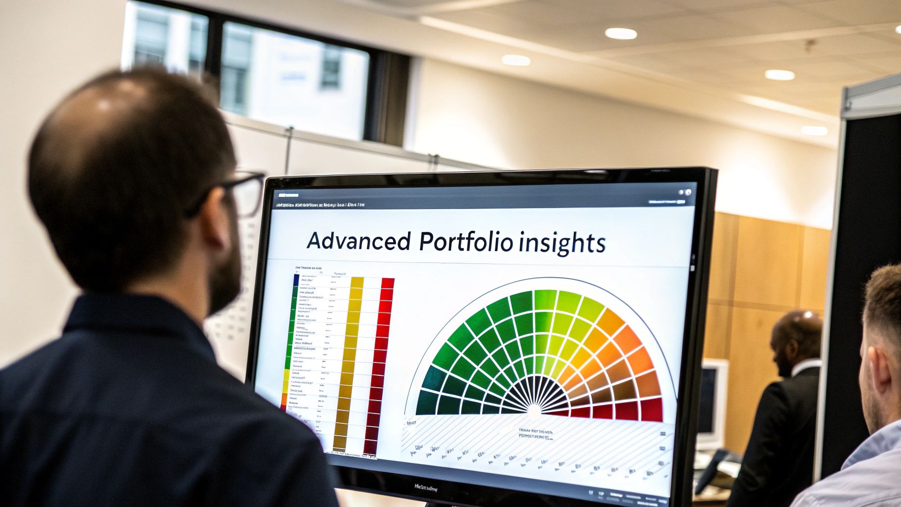
Advanced Techniques for Deeper Portfolio Insights
Once you’ve run a few basic backtests in Portfolio Visualizer, you’ll have a good handle on the “what”—how your portfolio performed historically. But to really level up your strategy, you need to understand the “why.” This is where the advanced tools come in, helping you stress-test your assumptions and prepare for a future that won’t just be a replay of the past.
Think of it as moving from being a passenger to getting in the driver’s seat of your strategy.
We’re about to dive into some of Portfolio Visualizer’s most powerful features. These aren’t just for show; they offer practical insights that can seriously sharpen your decision-making and build the discipline needed for the long haul.
Decoding Your Returns with Factor Analysis
Did your portfolio do well because you’re a genius, or were you just riding a massive market wave? Factor analysis is the tool that answers this brutally honest question. It breaks down your returns to see how much was driven by well-known market “factors.”
These factors are simply common characteristics of stocks that have historically been linked to higher returns. The Fama-French Five-Factor Model is a fantastic starting point and includes:
- Mkt-RF (Market Risk): Simple exposure to the overall stock market. How much of your return came from just being in the game?
- SMB (Size): Your tilt toward small-cap stocks versus large-cap ones.
- HML (Value): Your exposure to value stocks (think low price-to-book) versus growth stocks.
- RMW (Profitability): A measure of your exposure to highly profitable companies.
- CMA (Investment): Your tilt toward companies that invest conservatively versus those that invest aggressively.
After running the analysis, you get a table of coefficients. If you see a high, statistically significant number next to “HML,” it tells you your portfolio acted a lot like a classic value fund. If your “alpha” is hovering around zero, it means these factors explain almost all of your returns. That’s not a bad thing! But if you find a significant positive alpha, that’s the holy grail — it suggests your strategy is delivering something extra, a return beyond what these common factors can explain.
Are You Truly Diversified? An Asset Correlation Check
This is a big one. So many traders think they’re diversified because they own a dozen different tickers. But if all those assets nosedive together in a crisis, you aren’t diversified at all. You’re just holding a dozen different anchors.
The asset correlation tool is your reality check. It measures how two assets move in relation to each other on a scale of -1 to +1:
- A +1 means they move in perfect sync.
- A -1 means they move in perfect opposition.
- A 0 means their movements are totally unrelated.
The whole point of diversification is to find assets with low or even negative correlations. You want some things to zag when others zig. In Portfolio Visualizer, you can generate a correlation matrix for all your holdings. If you see a screen full of high positive numbers like +0.85 or +0.90, that’s a huge red flag. It’s telling you your portfolio is vulnerable and lacks the resilience it needs.
Peering into the Future with Monte Carlo Simulations
Historical backtesting is essential, but it has a huge blind spot: it only shows you one possible past. The market could have taken countless other paths. That’s where Monte Carlo simulations come in.
Instead of just replaying history, a Monte Carlo simulation takes your portfolio’s historical data and runs thousands of potential future scenarios. It’s asking, “Given how this strategy has behaved, what’s the full range of outcomes we might reasonably expect?”
The true power of a Monte Carlo analysis is that it forces you to think in terms of probabilities, not certainties. It shifts your mindset from “What will my return be?” to “What is the likelihood of me achieving my financial goals?”
You’ll typically see a chart showing a “cone” of possible outcomes, from the absolute best case to the depressingly worst. This helps you answer the really important questions:
- What’s the probability my portfolio drops below a certain value?
- In the worst 10% of scenarios, just how bad could things get?
- What’s the most likely value of my portfolio in 20 years?
This is a much more mature way to look at risk and reward. Sure, your backtest showed a 10% CAGR, but the future could easily be 5% or 15%. Preparing for that entire range of possibilities is what builds a truly robust strategy. This forward-looking approach works well alongside other methods, like walk-forward backtesting, which can better reflect real-world risk. To dig deeper, you can read the full research on advanced backtesting methodologies and really get a feel for these concepts.
Connecting Backtest Insights to Your Live Trading
A successful portfolio visualizer backtest isn’t the finish line — it’s the starting gun. It hands you a data-driven roadmap, but the real test is whether you can follow that map when the live market is throwing emotional curveballs at you every day.
The true measure of a strategy isn’t how it performed in a simulation, but how well you can execute it in the present. This is where your analytical work meets the messy reality of daily trading. We’re all wired to feel the sting of a loss more than the joy of a win, a nasty psychological quirk that can make you abandon a solid, well-tested strategy at the worst possible time.
The only way to fight that is to build a system that keeps you honest.
From Hypothesis to Actionable Process
Think of your backtest results as a baseline — a set of performance expectations. If your 60/40 portfolio backtest showed a -22% maximum drawdown, you shouldn’t be blindsided when your live account takes a -15% hit. You’ve already seen that kind of pain in the simulation. Knowing it’s within the historical range is what helps you stick to the plan instead of panicking.
This is exactly where a trading journal like TradeReview becomes essential. It’s the bridge between your historical analysis and your day-to-day decisions. You can build specific, actionable rules for yourself based directly on what your backtest told you.
For instance, you could create a custom tag in your journal called “Core 60/40 Strategy”. Every time you rebalance or make a trade that fits this model, you apply the tag.
This simple act of tagging does something incredibly powerful: it forces you to consciously ask, “Is this trade part of my plan, or is this an emotional, off-the-cuff decision?” It’s your first line of defense against drifting away from your strategy.
Creating a Powerful Feedback Loop
Once you start tagging your trades, your journal’s analytics light up. Now you can see if your live performance is actually matching the backtest’s expectations. This creates a powerful feedback loop where data guides your actions, and your actions generate new data for you to review.
Start by comparing a few key metrics:
- Win Rate: Is the win rate for your “Core 60/40 Strategy” tag close to what the historical data suggested?
- Profit Factor: Are your winners making enough to cover your losers, just like the backtest predicted?
- Average Hold Time: Are you sticking with positions for the intended duration? Or is fear or greed pushing you to exit too early?
If you spot a major disconnect — say, your live drawdown is way worse than the backtest’s maximum — it’s a signal to dig deeper. Maybe current market conditions are genuinely different, or maybe your execution is slipping.
This process of constantly comparing your live results to your portfolio visualizer backtest is what separates methodical traders from gamblers. To learn more about building this kind of structured approach, check out our guide on backtesting trading strategies for a deeper dive.
Ultimately, backtesting defines the plan, but your journal verifies the execution. It gives you the accountability you need to stay disciplined, helping you spot deviations before they become costly mistakes and ensuring the strategy you so carefully tested is the one you actually trade.
Answering Your Biggest Backtesting Questions
Even with a powerhouse tool like Portfolio Visualizer, running a backtest is just the first step. The real journey begins when you start questioning the results, grappling with the “what-ifs,” and trying to connect those numbers to your real-world trading. It’s a healthy part of the process.
Let’s dig into some of the most common questions and hurdles that trip up traders. Getting these answers right is key to building real confidence in your strategies.
How Far Back Should My Backtest Go?
The short answer? As far as you possibly can.
The entire point of a portfolio visualizer backtest is to see how your strategy holds up across different market environments. A strategy that looks like a world-beater in the post-2009 bull market might completely fall apart when you run it through the 2008 financial crisis or the dot-com bust.
You absolutely need to test across multiple full market cycles, which means including both roaring bull markets and devastating bear markets. This is the only way to get a true picture of your strategy’s character and uncover its real potential for gut-wrenching drawdowns.
Why Don’t My Live Results Match My Backtest?
This is the million-dollar question, and trust me, every single trader has felt this frustration. The gap between a perfect backtest and messy reality often comes down to a few key culprits:
- The Hidden Costs: A backtest can model commissions, but it can’t perfectly replicate real-world bid-ask spreads, taxes, and other transaction costs that slowly chip away at your returns.
- The Human Factor: A backtest executes flawlessly, like a robot. You, on the other hand, are human. You might hesitate on an entry, get scared out of a winning trade, or chase a position out of FOMO. Every one of these emotional decisions creates a deviation.
- Markets Change: The past is a great guide, but it’s not a perfect map of the future. The economic environment is always shifting, which can change how different assets behave and correlate with each other.
Think of your backtest as the ideal benchmark, not a guarantee of future returns. The real game is to keep your live trading as disciplined and close to that tested model as you can.
Can a Backtest Really Prepare Me for a Market Crash?
Yes, absolutely. While it can’t predict when the next crash will happen, it’s invaluable for showing you how your portfolio would have survived the last ones. This isn’t just about numbers; it’s about building psychological armor.
For example, when you see for yourself that a 100% stock portfolio might have declined over 50% in 2008, while a 60/40 blend might have “only” lost 25-30%, that lesson sticks. It transforms risk management from a boring textbook concept into a tangible, memorable experience. You can find more great insights on using downturns in backtesting portfolio strategies on ExtractAlpha.
This kind of preparation is what helps you stick to your plan during the storm instead of panic-selling at the absolute worst time.
A solid backtest gives you a plan, but a detailed trading journal is what keeps you accountable to it. TradeReview is the bridge between your backtest insights and your live trading results. Tag your trades, compare your live performance to your backtested benchmarks, and find your edge.
Turn your backtest into a real-world advantage. Start your free journal at TradeReview today.